Sleep Easy Rosberry
Task
Sleep Easy is a comprehensive sleep solution that has been developed over 25 years by Dr. Richard Shane, an internationally-renowned sleep expert. Dr. Shane specializes in treatment of chronic insomnia and has worked with thousands of patients. The task set by Dr. Shane was to design and develop an app which would bring his effective method to the public, making good sleep even more accessible than ever
Ideas and solutions
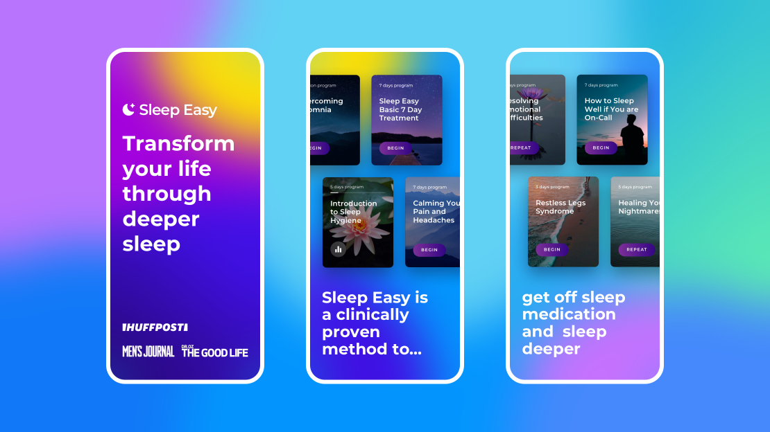
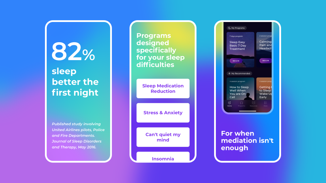
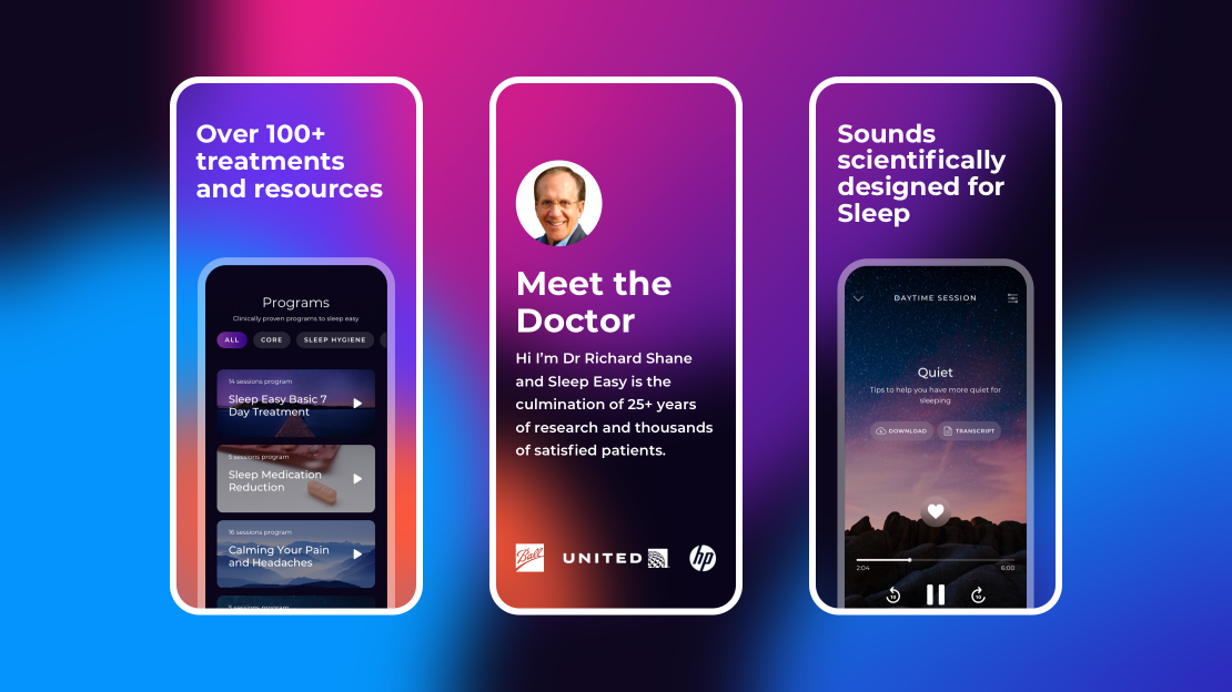
The design we offered for the Sleep Easy app may be called supertemporal. The colours, typeface, and the stylistic solutions, for example the pictures inside the app, are not tied up to certain trends. That is why, the look and feel of the app will continue to be relevant much longer. The Montserrat Typeface, as the classics of grotesque, is a good choice for headers and body text. Sleek round-shaped airy forms at the heart of this type make it soft and easy to read. The colour palette is basing itself on the premise that the app will mainly be used at night time. Dark-purple makes the cards with pictures stand out and puts a user in a more positive and relaxed frame of mind. The gradient resembling a warm sunset chosen for the buttons is a vibrant emphasis fitting perfectly into the overall pallette and app concept. Inside the app we’ve used blurred semi-transparent omni gradients for the content to blend in with the landscape backgrounds. Though the Sleep Easy app is about solving serious sleep issues, we’ve used vibrant pictures and images for the users to perceive programs and practices, the method offers, as a pleasant and positive experience. For the App Store we’ve designed some bright and even flamboyant screenshots with gradients which are different from the overall Sleep Easy style. The thing is that all the apps about sleep and meditations look really calm and peaceful, and users have to choose from a long list of almost similar products. Together with our client we’ve decided to stand out and attract users through the bright and catchy app image.


