Rebranding of Perm Polytech Третьяков Дмитрий
This work
in other
nominations
Brand Identity
Task
Radical changes brought by globalization and rapid advancement in technologies set higher standards in education and make universities rethink their position towards students, society, and the world. Perm Polytech is one of the oldest and largest technical universities in Perm and Ural region. With the emergence of new challenges that call for global vision, Perm Polytech found itself in the need for changes in strategy, corporate culture, and branding.
Ideas and solutions
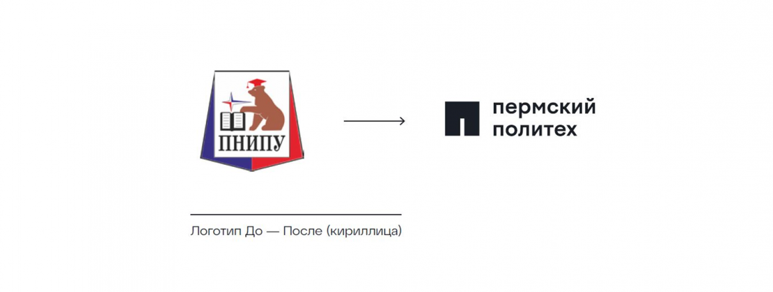
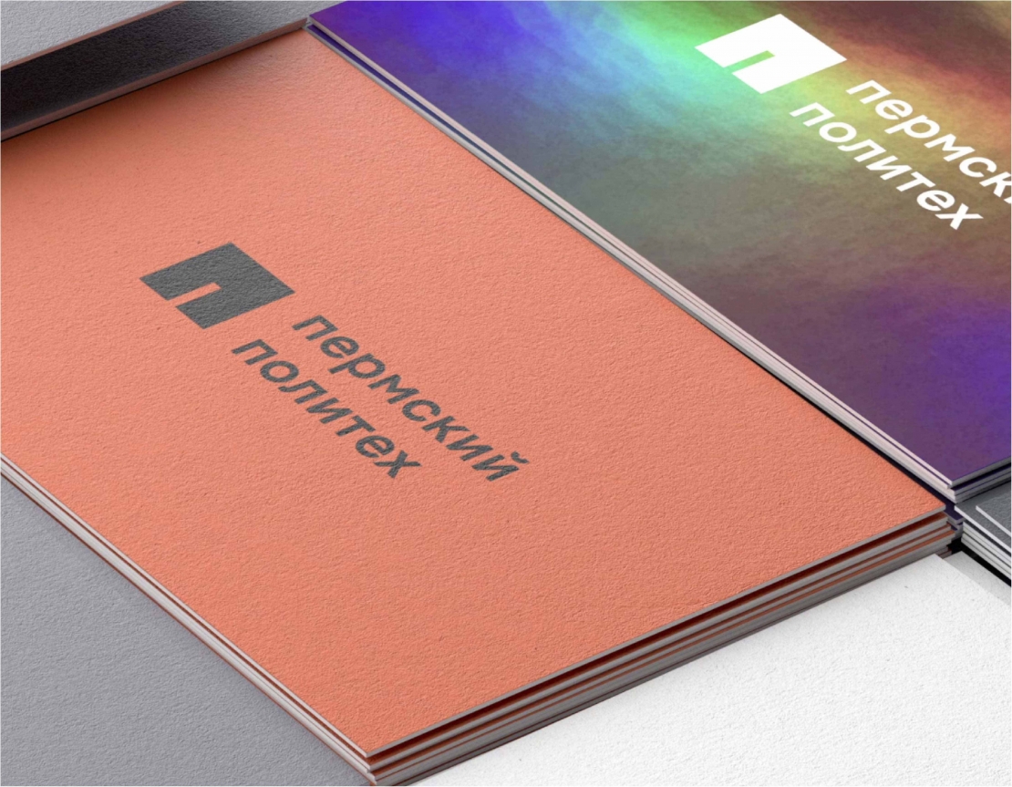
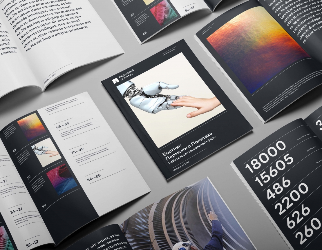
The target audience of Perm Polytech rebrand were high school graduates (as potential students), existing student body, faculty and administration, industrial partner-companies (as potential employers of university alumni), Russian Ministry of Education, as well as international academic community and foreign students. The brand vision, mission and values that we have developed address every target audience of the brand. Inspired by science and creativity, Perm Polytech molds leaders for the fast-paced world, which is reflected in brand's proposition: «Freedom to create your own world». Perm Polytech is a space for creativity, where students learn self-expression through academic disciplines in order to build their own path to achievements and contribute to the development of society. Following the new philosophy, we created a design that is based on the idea that Perm Polytech is a creative environment where students learn how to express themselves through academic subjects in order to pave their own path to success and to contribute to the common good. All these values are reflected in the new brand design, including square shapes, lines, geometric grotesque of the fonts and chromatic color palette complimented with abstract pixelated pattern. The new logo consists of a black square with each side being a definition for determination, focus, pragmatism, and methodical approach to things; and together they constitute Russian letter “P”, the first letters of the brand name Perm Polytech. Space gray is used as a primary color. Besides being a symbol of infinity, it reflects intelligence and balance. As a pattern, we proposed abstract pixelated shapes in various combinations and color gradations. As a result of the rebranding, Perm Polytech has a well-structured and straight-forward brand that will help to convey its values to the target audiences and transform the institute's strategy to life.


