Recycling company "Sobirator" identity Погосян Элцик
Task
Sobirator — is a Russian company, that is engaged in the reception and processing of recyclable materials. The main purpose of the project was to make a non-trivial and unique design, that would differ from competitors. Recycling is important and recycling brand identity should attract people to take care of the planet and make them rethink their views on consumption
Ideas and solutions
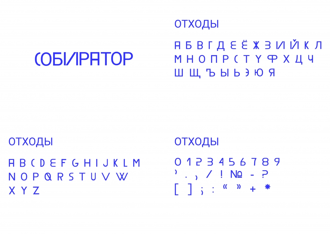
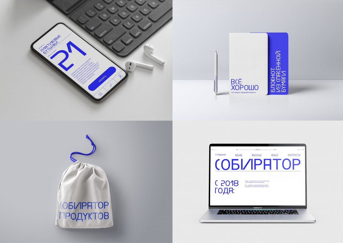
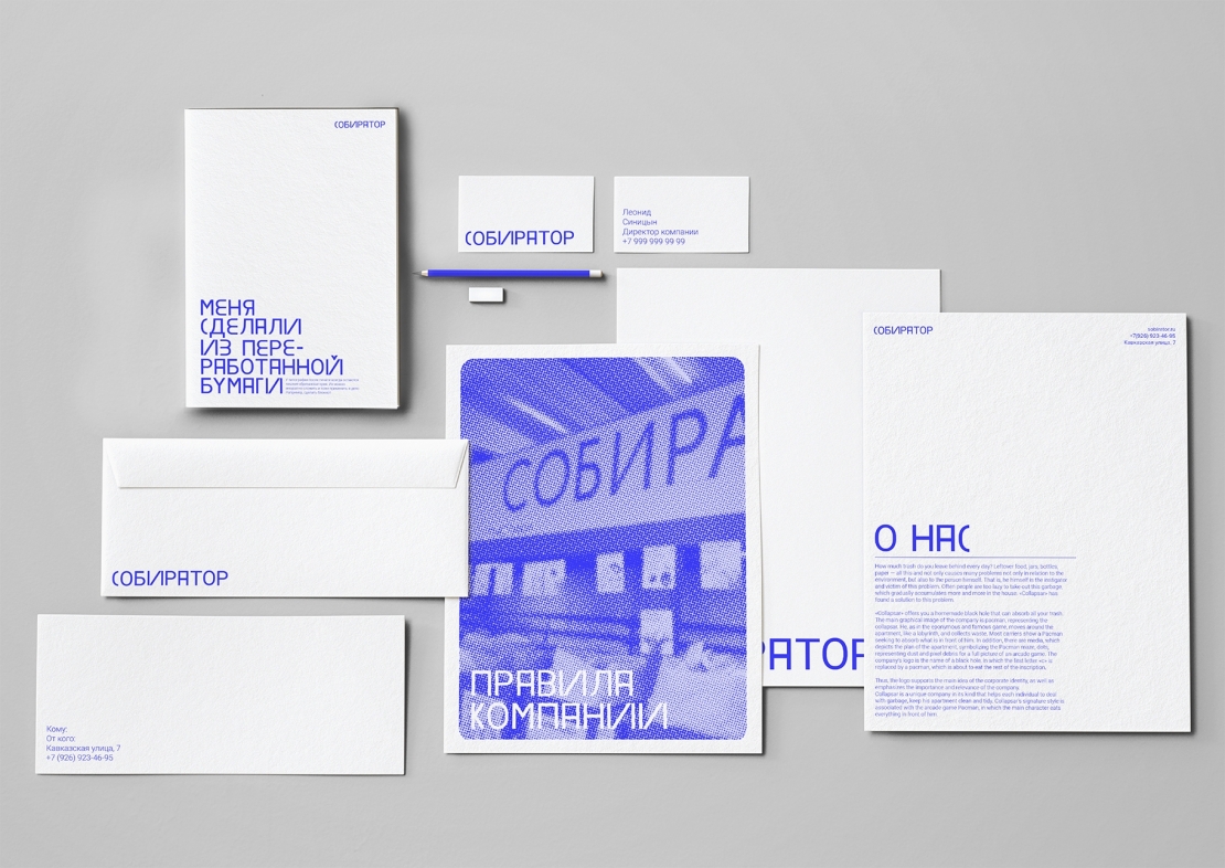
This branding concept of "Sobirator" is based on the idea of reusable letters. The key feature of identity is “recycled” font, which was made from different parts of the word "waste"(translated into Russian). By that method, there are no unnecessary letters in the design and every word is reused. It is important to mention, that branded merch supports the idea of reasonable consumption, as it was made from recycled materials. For example, a bag, that was made from advertising banner or notebooks made from “saved” and unused paper. Moreover, digital media play an important role in the branding. Due to them company can contact young and modern audience and promote their ideas without producing any products or banners. That is why a new website of the company and mobile app for tracking good habits were designed. On the website a person can read some ecological news, garbage collection rules or answers on the most popular questions about company. As for the mobile app, a user can track some eco-friendly habits every day and level by level achieve reasonable consumption Behance of the project: https://www.behance.net/gallery/122666033/sobirator Website prototype: https://clck.ru/WXtmg Mobile app prototype: https://clck.ru/WXto


