bicycle space SKID Лебедева Татьяна
Task
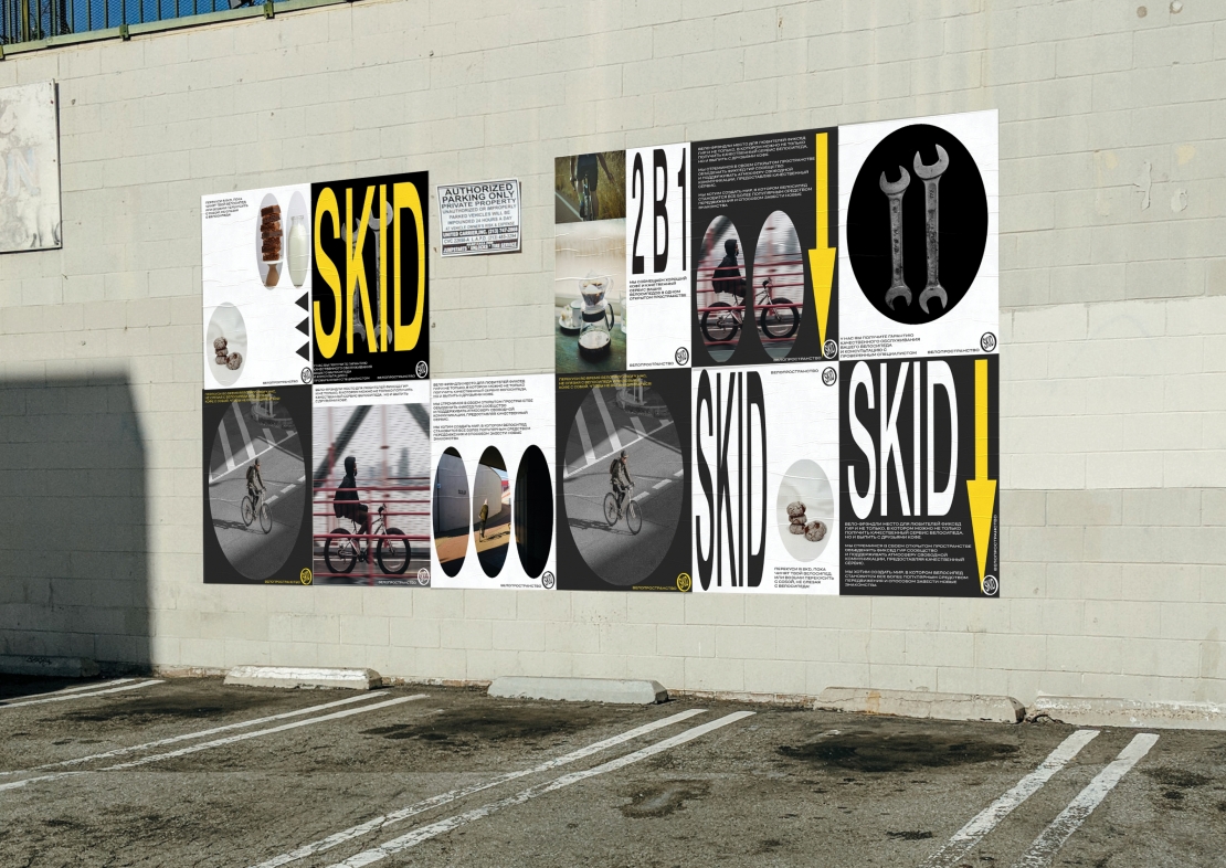
SKID is the unique organization which contains bicycle workshop and coffee house. SKID focuses on the underground movement of Fixed Gear cyclists. They are distinguished by the audacity of driving on the road. However, in my humble opinion, one of the most important purposes of SKID is popularization of the whole bicycle culture, embedding this elemen in people's lives. It was necessary to convey the same audacity and desire for freedom in the identity
Ideas and solutions
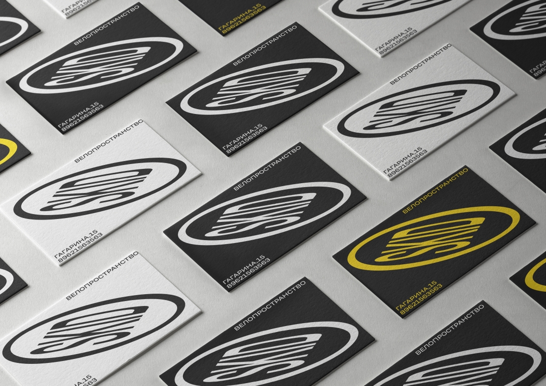
The main metaphor is an elongated road marking that sweeps in front of cyclists. Signs can stretch and distort at any angle. Typography becomes elastic, like road signs and boldly changes in format. I used Helvetica in titles. Grotesk Tera supports experiments with typography and creates a pleasant contrast.


